
Hi there. I have just arrived at the studio and want to type down some thoughts on the things I’ve been doing.
Firstly the two bays blue stone one
*picture*
I did the first layer copying an A4 painting. Then I left it for a while. Then I came back to it and put on top another A4 painting of the blue rock. A close up of the same rock that is small and right at the top of the first layer.
Now on top I want to add yellow and blue swathes. Like in this other A4 painting I did the other day.
I am trying to listen to the painting and do what it tells me. Give up being the designer and let the painting lead the way, the creative voice lead the way.
At the moment the painting is not telling me to add yellow and blue swathes. Instead it is telling me to leave it for a while.
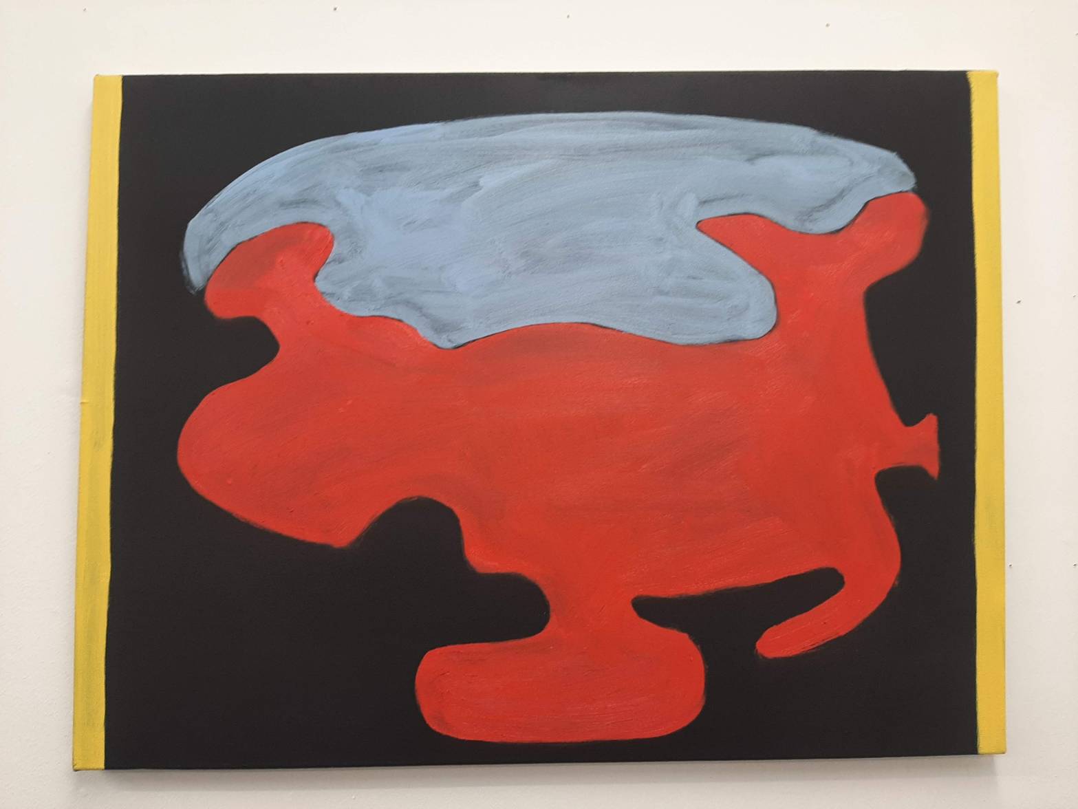
Then there’s the red island painting. This one is telling me to do something. I really like it so far. I love the matt black background and the different shapes. It’s quality in its materiality so far. I am amazed at how much a well prepared surface makes to the painting. Mind blown that I have never done that before!
I think it might be done actually.
Going back to the blue two bays painting I really don’t like that the blue square in the middle is full of lots of bits. It’s very distracting and unnecessary. It brings the quality of the painting down. I’m going to scratch them off now.
And then also yesterday I’ve made these small paintings of a standing stone in Cornwall.
I did these strange paintings with multiple suns casting shadows on the standing stone from multiple angles. I also painted the murmurations that I remember we saw above us in that very field.
Painting on unprimed paper has this lovely quality to it that you can’t get with primed paper. I actually really like the way the paper absorbs the oil and gives the paint this feel of impressedness rather than luxurious paint. When the paint is generous the focus is on the paint – the brushwork, the process, the painter. When the paper is unprimed the paint sinks in and the focus is on the composition.
I don’t know whether the bigger paintings need to have this same quality though. Maybe they’re other things, not larger recreations of the A4s.
What next? I am burning to start another painting. I have been looking at the map shapes on the wall: *pic*
One specific one of this ultramarine blue overhead island shape. It works that there is black around it – that the shape doesn’t take up the whole canvas. The space around the shape comes into question.
What else to say? I feel I must keep writing.
———
I’ve started a new canvas *pic*, picked the blue bits off the other canvas and done some small paintings. This new white painting is because I will put the ultramarine blue over the top and hopefully it will glow because of the white underneath it. Because it is a pretty transparent colour if I had put it on the black it would have been a very dark blue, not the same as in the A4. The shape looks like a cartoon car or something. Completely removed from the original island, I can’t even pick out shapes in it that resemble the original place. That’s interesting as a way to paint. I have removed the landscape from the painting. The only idea I have of the island left is the black space around the island is the empty space around the island, the desert of sea in which the island is surrounded.
So now that I can’t see the shape as the island, I am dealing with the painting as an abstract form, with some ideas about depth and space of the black behind. It’s perhaps helpful that I can’t see the shape as the island because I can deal with the painting as it is. I can be present with what’s in front of me rather than answering to a memory inside my own head. That was the thing with the scilly painting I started in Manchester, I felt I was answering to the memories in my head rather than the canvas in front of me. The canvas was subservient to the memory but that didn’t make the painting very good. Now I am using the memory as a starting off point but then once the shape(s) is/are on the canvas I separate it from my memory and deal with it as a painting. Let’s see what happens.
I’ve got these new A4s on the wall of the two bays and blue rock on top. Then on top of that I’ve put these nude/orange and light blue swathes of colour, semi-transparent. It looks good. But I feel it needs to be used for more than just it looking good.
———
When I look at the red painting I don’t look at inside the shape, I look at the black space around the shape.
I think that’s because this painting is about the black space around the island / shape. The painting is about space. Negative space around land. The shape is just there to delineate this space. It’s not about what’s on the land. I am painting in negative space. Am I doing that very successfully? I could do better. What about bigger canvas?
Am I still painting open space then? The empty space around the island. I think that’s still the subject of the work somehow.
I like adding the sun as a dot because it suggests vast distances. A white or yellow dot = sun = vast big distances into space. The mysterious, flat space around the painting suddenly becomes charged with the sky. But it doesn’t quite make sense because there is no horizon and the shape in the middle of the painting doesn’t resemble anything like a landscape. Hmm. That’s interesting.
It may be interesting to layer up many island shapes one on top of the other onto the canvas. Why? Thinking about shapes delineating space. I need to get some more stretchers! So I can do more and more. I like it when there is empty space left in the canvas. I mean so the island shape is off centre, and there is empty space next to it. Then the empty space becomes part of the subject. Wow is mad because I was thinking about this when I was in Scilly. Painting empty space. I have been thinking about this for ages and ages, this is a new way to do it. Taking advantage of the flat picture frame, and the sun? So I want to do an island shape off to the side. Like the island with the white brushy outline and the yellow ring. But what colour to use? Maybe I should do some tests but I just feel scared! Make a decision and go with it? I have much more fun when I’m painting these small A4 things. Working very quickly and with abandon. So much more fun. How can I do that with bigger paintings? Maybe I do these island shapes on the A3 watercolour paper rather than the canvases? Just to test different colours? Yeh maybe.
